I’m currently working on a new keywords API for uClassify. This will allow users to get information about what words that are good discriminators for certain classes. To test this API I spent last weekend to built a visualization application for urlai.com.
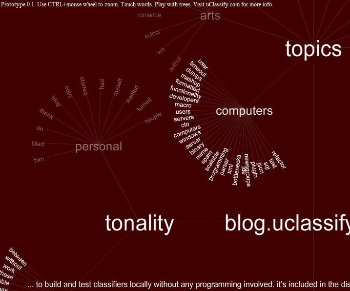
Here is a screenshot how the visualization prototype show data:

I would very much like to get some feedback on this, you can try it here, please comment below.
Really nice! For a word geek like me – I love to be able to dig into the words behind the class!
1. I like that I can zoom in/out and arrange the trees so they fit into screen dumps
2. I get curious abut why certain words get into the trees (plot out frequencies in ToolTip?)
3. It would be great if there was some way of visualizing the relative size of each class, maybe font size of the class name with % in tool tip?
Thanks Mattias!
1) Good – I will see if I can improve the zooming, it seems to be a problem with some browsers who likes to start scrolling instead.
2) In this first draft of the keyword api I am not sending probabilities or frequencies, but will consider adding it.
3) Good point, I will try to add something like that for the next version. Right now the alpha (brightness) of the classes are scaled depending on their probability. All keywords inherit this alpha. I also think coloring the clusters would help.
Thanks for the feedback! Let me know if you come up with more ideas.